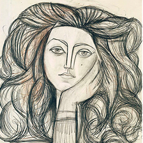
This is the last part in a series of three commentaries about color, fashion and society
I choose colors the way many people do: I dress to match how I feel, or to stage how I want to be perceived that day. Some mornings I want a bright color to announce energy I don’t fully have yet, as if pigment could generate the mood it signifies. Other days I choose black not because I’m sad, but because I want quiet, a kind of self-erasure that reads as competence. In that sense, color becomes a volatile language: expressive, immediate, and sometimes futile, because the meaning you intend is never the meaning others receive.
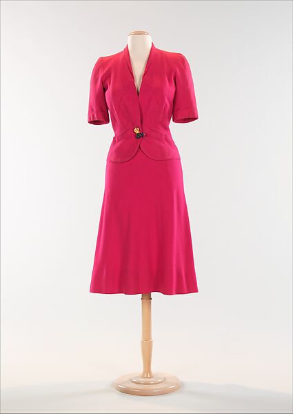
Pastoureau’s perspective makes that volatility feel less like personal miscommunication and more like the normal condition of color: meanings are shared but never stable. A red dress can read as power, seduction, celebration, danger, or “too much,” depending on context and observer. A yellow sweater can be joy, optimism, or childishness. Color is one of the few signals that can be simultaneously intimate (it tracks mood) and public (it demands interpretation).
This is why color functions like a social contract: a tacit agreement that certain hues “mean” certain things, even if we never signed anything. When I wear a muted palette, I’m not just expressing calm; I’m aligning with a widely rewarded code of seriousness. When I wear saturated color, I may be claiming freedom, but I’m also taking on social risk: the risk of being read as unserious, excessive, attention-seeking, naive, or simply “not appropriate.”
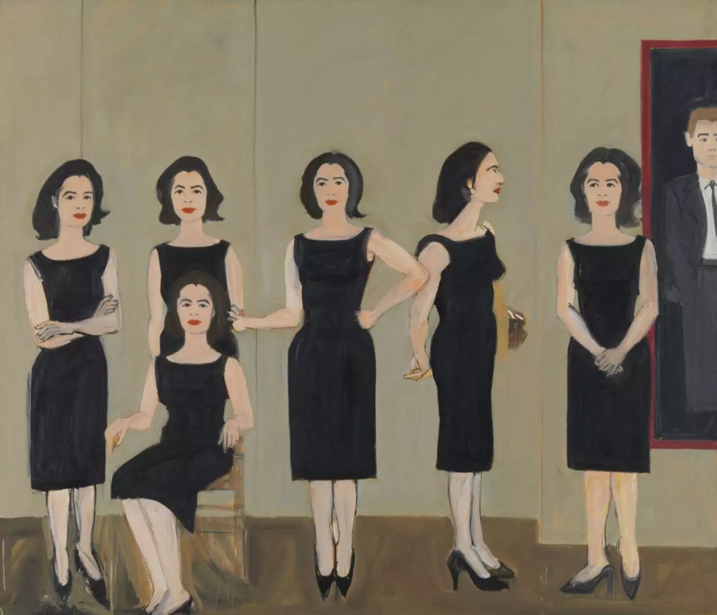
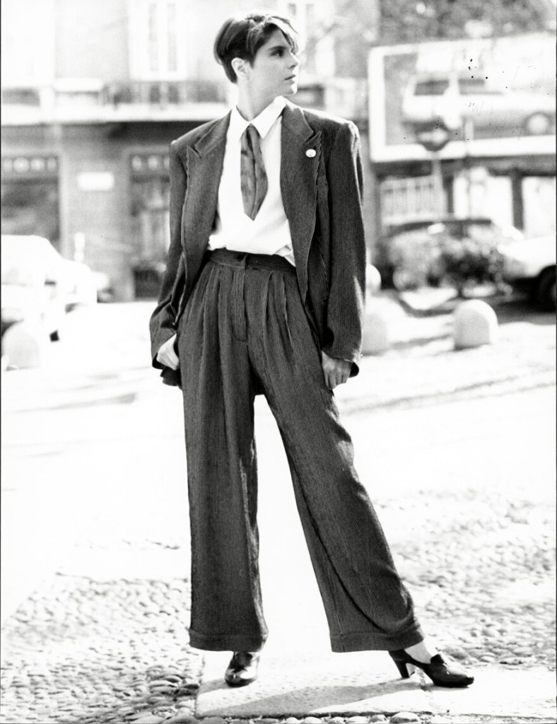
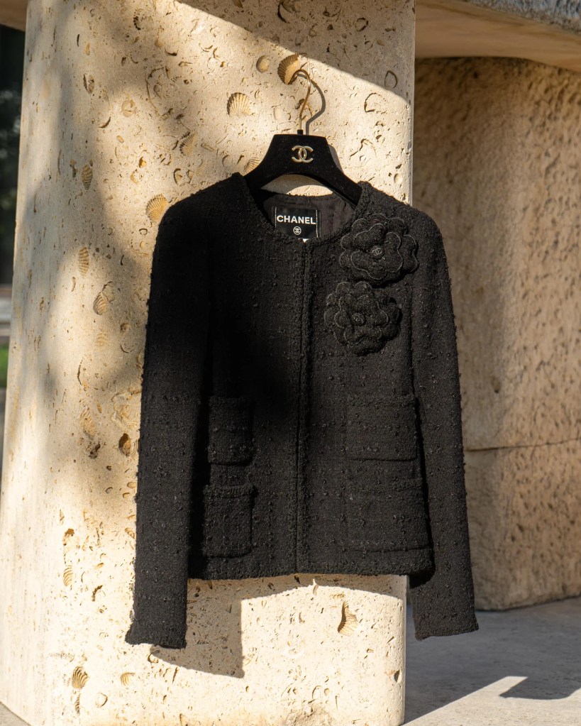
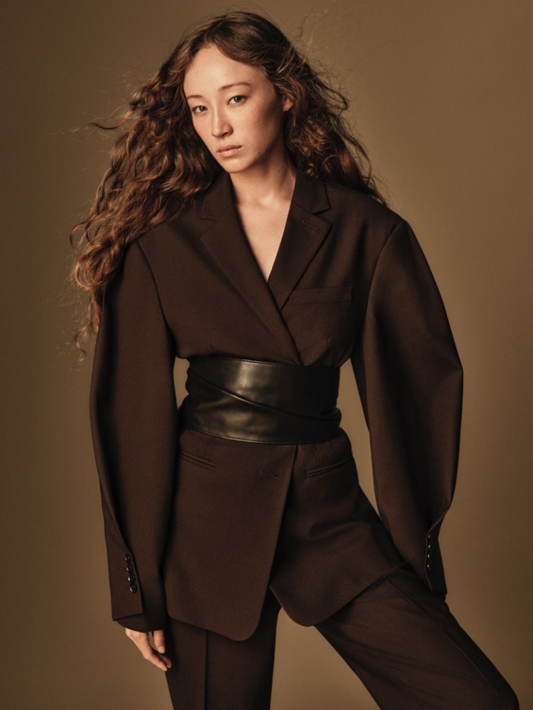
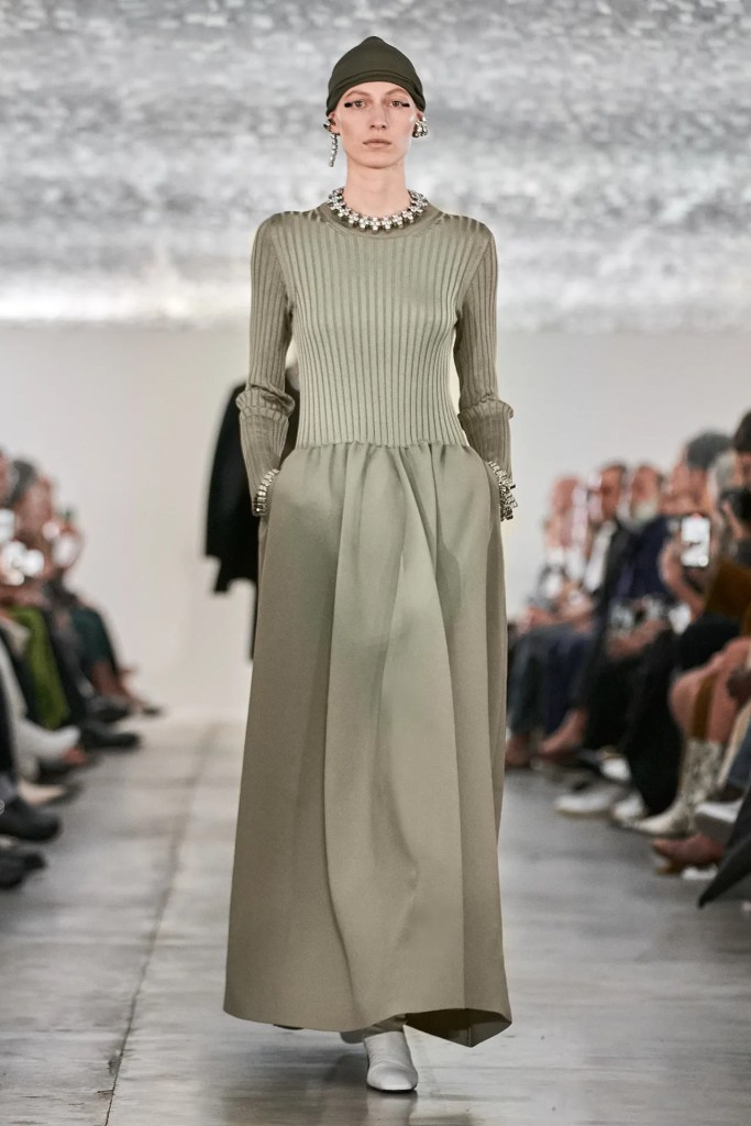
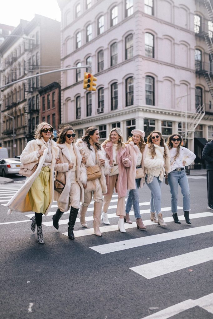
Our societies, especially in professional, urban, Westernized contexts, often prefer muted colors: blacks, whites, greys, navies, beiges. There are practical reasons (they mix well, age well, photograph well, travel well), but practicality is never neutral. Practicality is a value system. It suggests that the ideal subject is efficient, modular, optimized, someone whose wardrobe behaves like a well-designed interface. Muted palettes are the uniform of frictionless modernity.
In that sense, the dominance of neutrals is not just aesthetic minimalism; it’s a cultural mood. It aligns with a world obsessed with productivity, legibility, and control. “Clean” colors reflect “clean” living: tidiness as virtue, moderation as maturity, the fear of being too visible. If color is historically tied to pleasure and ritual, then neutral palettes can reflect a society that is suspicious of pleasure unless it is disciplined and monetizable.
Luxury both feeds and complicates this. On one hand, luxury profits enormously from neutral investment dressing: the coat that lasts, the bag that matches everything, the shoe that survives seasons. On the other hand, luxury also sells fantasy, and fantasy has often been chromatic. The industry’s dance, then, is between permanence (neutrals as status) and seduction (color as desire). Color appears as controlled eruption: seasonal capsules, accent accessories, limited editions, a “moment” rather than a structural commitment.
There’s also the class dimension of visibility. Loud color can be coded as “trying,” while muted palettes can be coded as “natural” sophistication, an unfair distinction that reveals how taste polices social mobility. When “quiet luxury” becomes a dominant ideal, it isn’t merely a preference; it’s a moral narrative: true wealth whispers, true confidence does not announce itself. Color becomes implicated in the ethics of status.
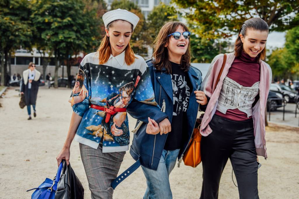
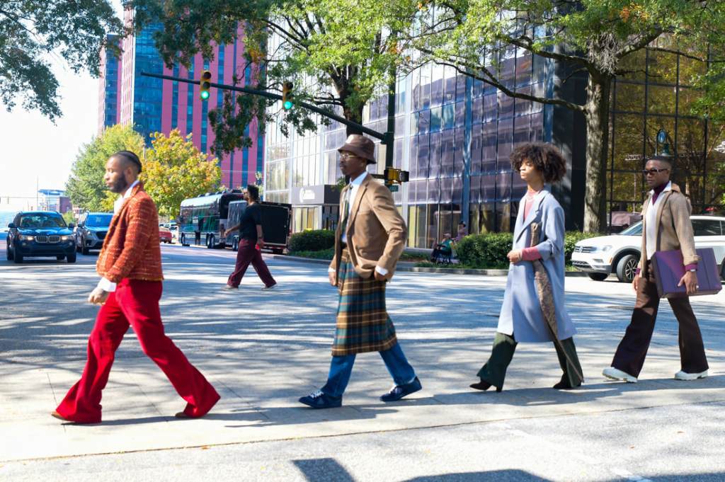
But the opposite is also true: color can become resistance to enforced invisibility. Choosing saturation, hot pink, ultramarine, acid green, can be a refusal of the neutral uniform, a claim to presence. This is why color often surges after periods of constraint: it offers symbolic compensation. If your days are standardized, your wardrobe can become the place where you permit excess.
And then there’s the technological layer: online shopping, filters, studio lighting, and color grading make color unstable. We buy an image of a shade and receive a physical reality that is slightly different, and that small difference can feel like betrayal. This pushes consumers back toward neutrals because neutrals are safer across screens. Even our digital infrastructures gently nudge us toward muted wardrobes.
The more I think about it, the more I see my own color choices as both intimate and deeply social. I still dress for mood, but mood is not purely internal. Mood is shaped by what the world rewards, what my workplace codes as credible, what my city reads as normal, what my generation fears appearing as. This is the deeper conclusion: color is not merely self-expression; it is a negotiation with norms. The social contract of color is written on our bodies every morning, and the question isn’t only what we feel: it’s what kinds of feelings we are allowed to make visible.

Leave a comment