This is the second part in a series of three commentaries about color, fashion and society
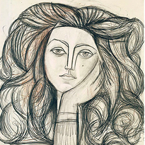
I read Roland Barthes’ The Fashion System a few years ago and I still remember the weird, almost comic shock: a book about fashion that contains zero images. It’s a relief and a provocation. Barthes makes you confront the fact that fashion isn’t only visual, it’s discursive. It exists as description, caption, editorial voice, product copy, and the subtle authority of words that tell you what you are seeing. When I reread him now, thinking about Pastoureau, I realize color operates in the same way: we think we see it, but we often believe it through language.
In Barthes’ framework, fashion is a system of signs: clothing becomes meaningful because it is inserted into an organized structure of differences: day/night, formal/casual, masculine/feminine, young/mature, tasteful/tasteless. Color is one of the most efficient ways to produce difference because it’s instantaneous. You don’t need to touch fabric or inspect tailoring to recognize “red.” You read it across a room. That’s why color is so powerful socially and so convenient commercially: it communicates fast.
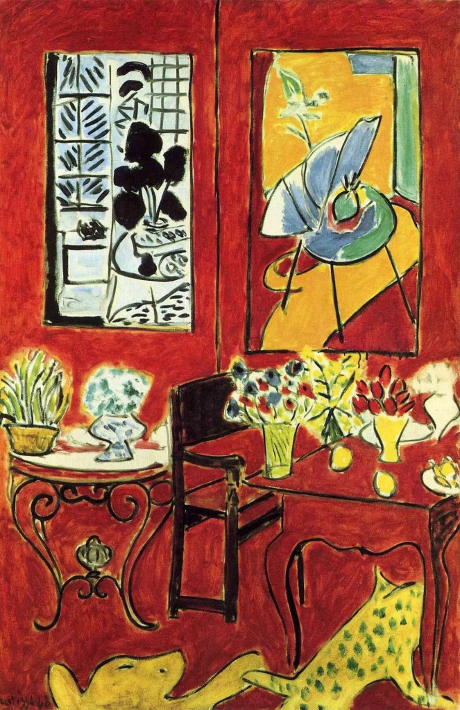
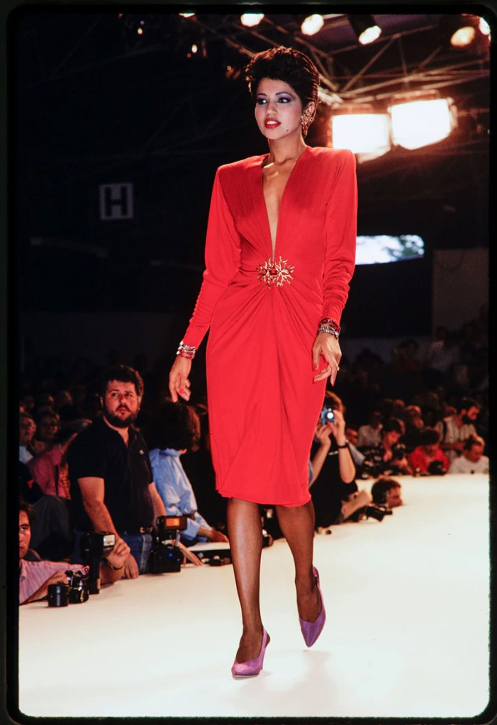
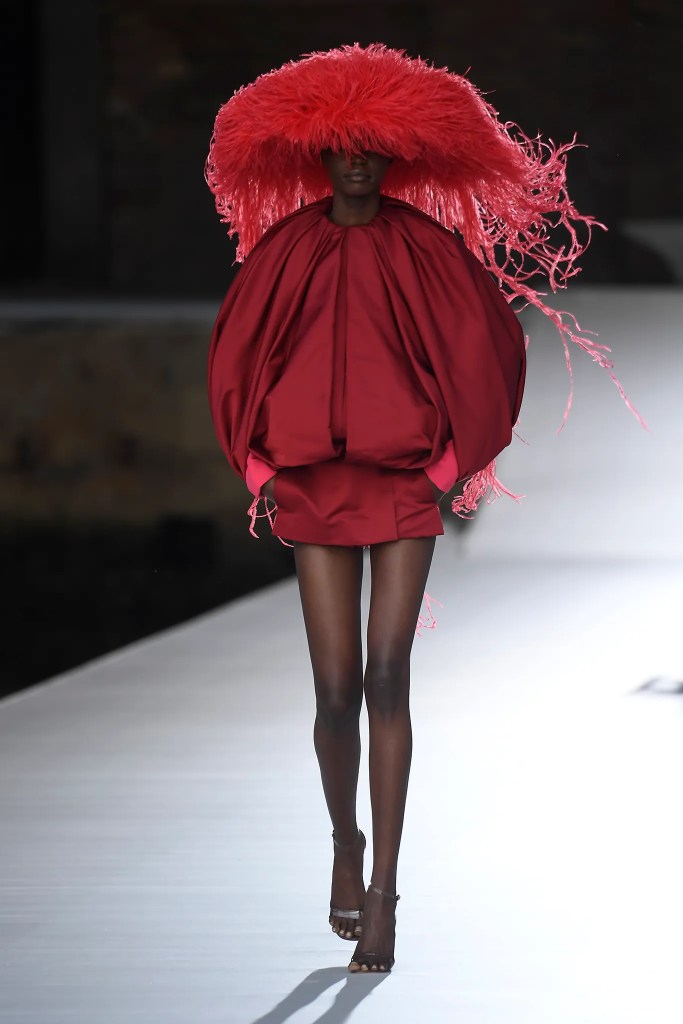
But fashion doesn’t simply say “red.” It narrates red. It breaks it into social roles: scarlet as seduction, burgundy as authority, vermilion as confidence, poppy as cheer. In luxury especially, naming is strategy. “Black” is too blunt; “noir” gives it ceremony. “Brown” is basic; “chocolate,” “cacao,” “tobacco,” “espresso,” “mahogany” turn it into atmosphere. Color names work like perfume notes: they sell an imagined life, not a pigment.
This is where my relationship to color feels surprisingly abstract. When I buy “oat” or “stone” or “ink,” I’m not buying a tone as much as a moment, a mood, a reference, a lifestyle shorthand. A shade becomes a small piece of narrative technology. It can imply softness or strictness; it can say “I’m serious,” “I’m tender,” “I’m expensive,” “I’m carefree.” Sometimes the name matters more than the shade itself because it offers an authorized way to feel about the garment.
The contemporary luxury lexicon borrows heavily from the natural and the edible: butter, milk, sand, clay, moss, smoke, slate, salt, olive, saffron. These words do double work. They make color feel sensual and intimate (you can taste or touch the reference), and they also make it feel legitimate (as if it comes from the earth rather than from trend). It’s a rhetorical move: nature is used to launder fashion’s artificiality into something that reads timeless.


Color naming also organizes hierarchy. “Taupe” is a middle-class sophistication word; “camel” signals heritage and status; “ecru” signals cultural capital, someone who shops with vocabulary. Even when consumers can’t define these precisely, they can sense that certain words belong to certain worlds. Luxury doesn’t only sell color; it sells the right to speak about color in a specific dialect.
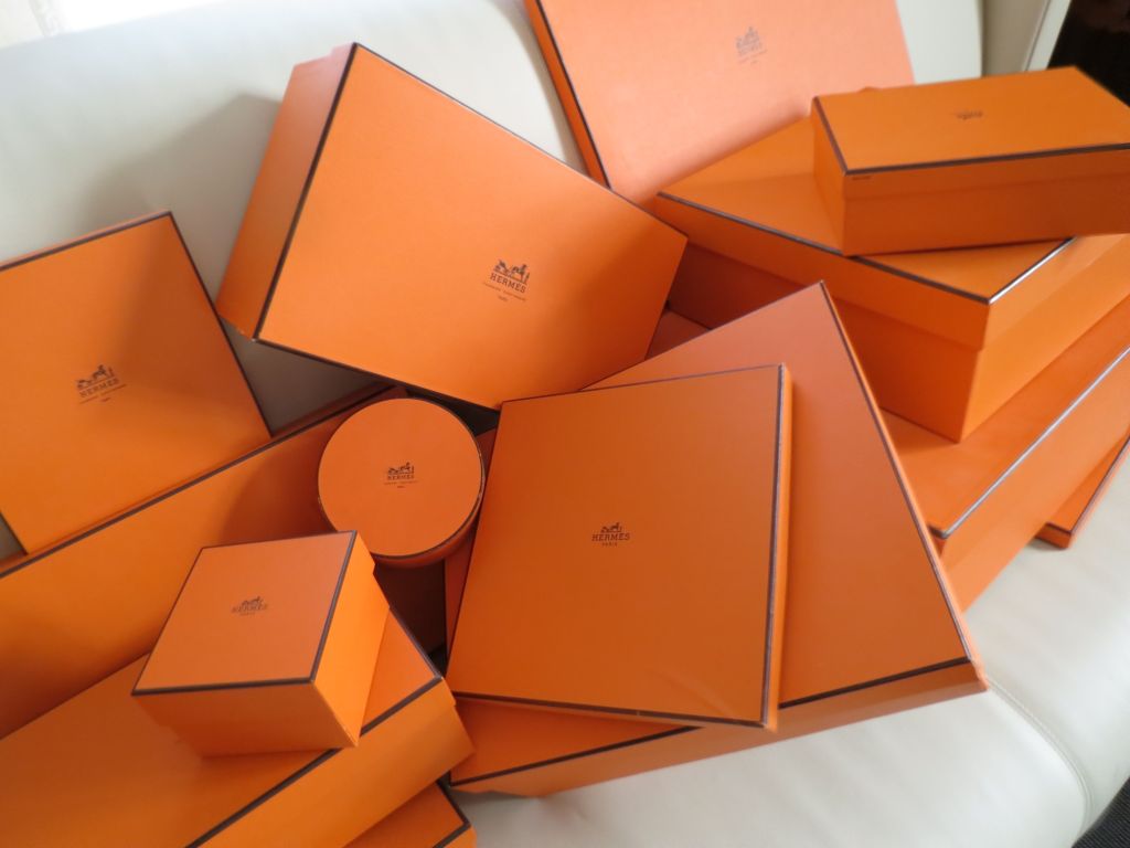
Then there’s color as brand territory. Some hues become quasi-proprietary in the cultural imagination, functioning as identifiers more powerful than logos. Think of how a certain blue can immediately summon a jeweler, or how a particular orange can feel like a house signature. The point isn’t legal ownership; it’s semiotic ownership. In saturated markets, a recognizable color becomes a shortcut to recognition, and recognition is a form of value.
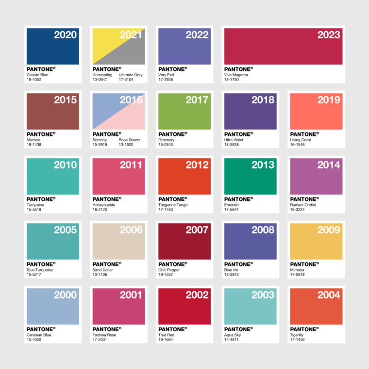
Trend forecasting formalizes this linguistic system. When institutions announce yearly colors, Pantone’s ritual is the most famous example, they aren’t merely describing taste; they are coordinating it. They offer industry and consumers a shared narrative: this is the mood we are collectively entering. Even if you reject it, you’re still responding to it. The “color of the year” works less like a command and more like a calendar of feeling.
Social media compresses all of this into tags, Barbie pink, tomato red, clean-girl neutrals, turning shade into meme and meme into market signal. This is where Barthes feels newly contemporary: words don’t only explain fashion, they produce it. A color becomes a content category; the category becomes desire; desire becomes inventory decisions. The system has become faster, but the mechanism is the same.
The meta conclusion, for me, is that color proves fashion’s most paradoxical truth: we call it visual, but it runs on language. We rarely encounter color innocently. We meet it already narrated, by history, by marketing, by class codes, by the stories we were taught to associate with a hue. To study color in fashion, then, is not just to study palettes; it is to study the vocabulary that makes palettes feel inevitable. We don’t simply wear shades. We wear the stories that make those shades intelligible.

Leave a comment